Brand identity
Remed
Brand Identity
for Remed, a sustainable women’s skincare supplement
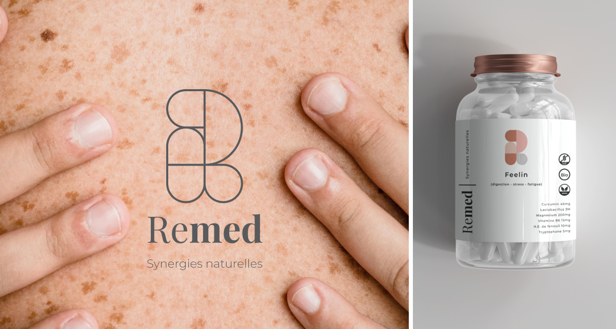
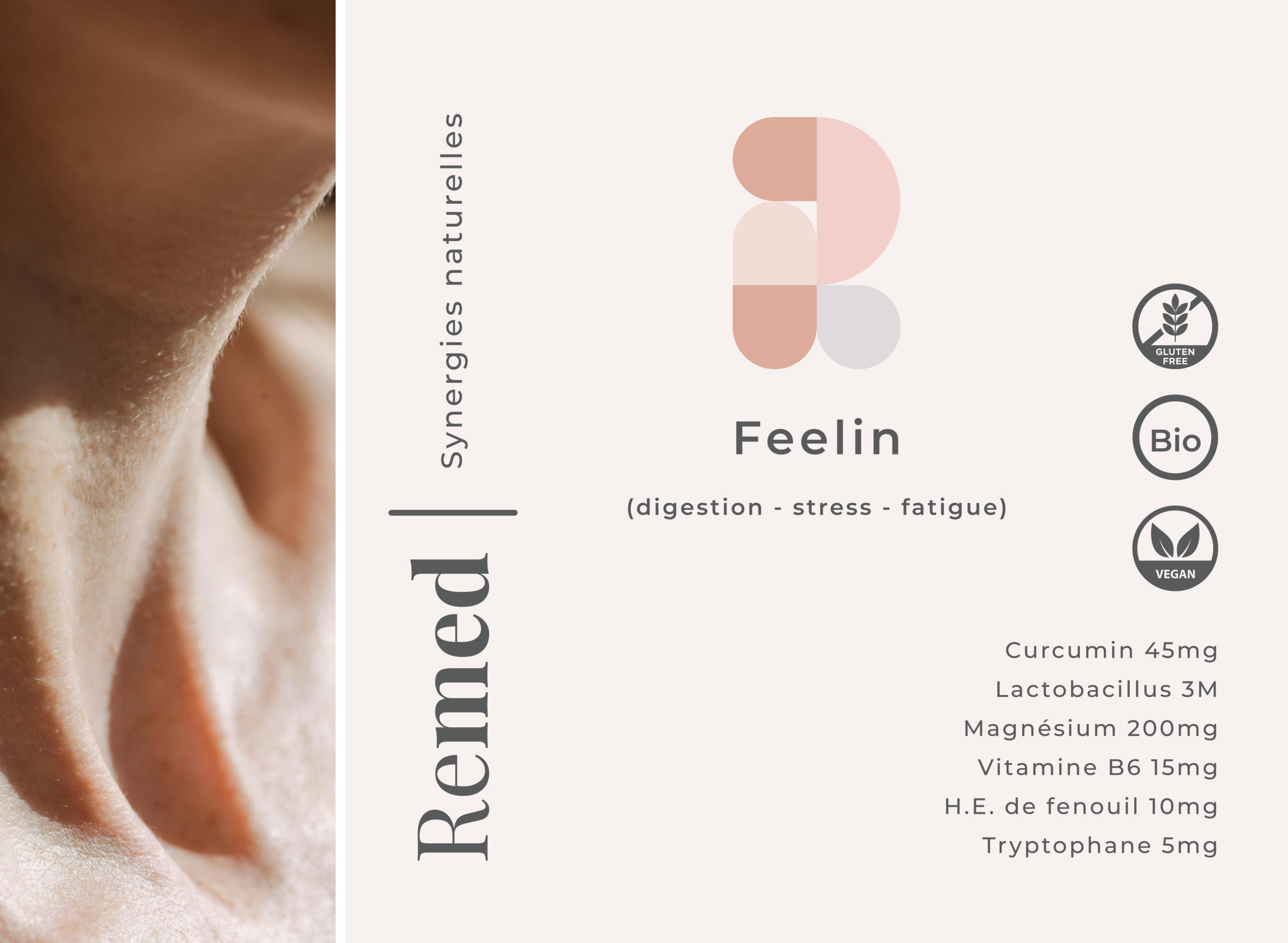
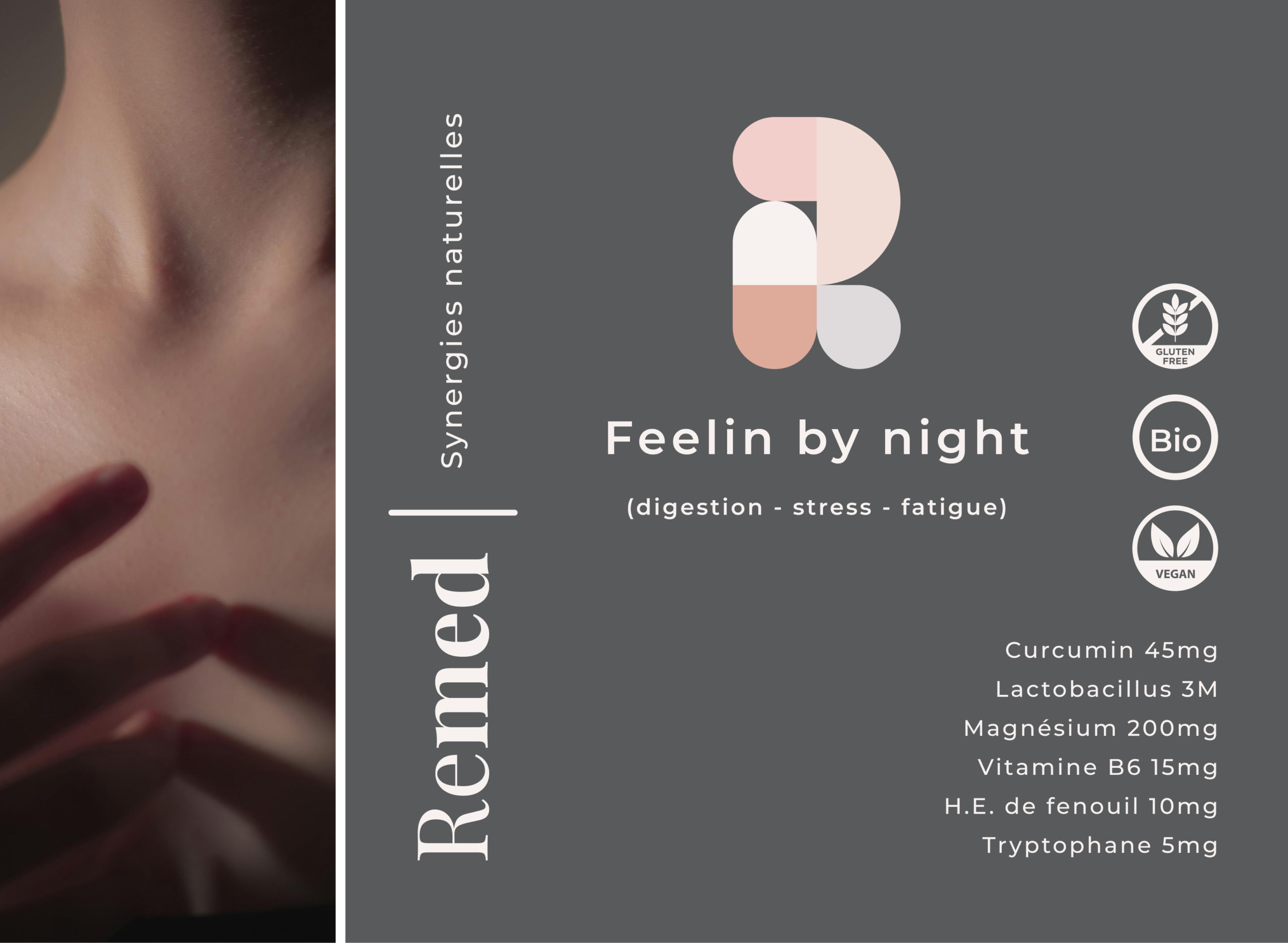
I have been working on developing the brand identity for a women’s dietary supplement brand that was intended to be sold in pharmacies. This project involved creating a comprehensive and engaging brand image, including designing a logo, defining brand colors, and crafting a unique voice for the brand. A key aspect of the project was ensuring that the packaging reflected the brand’s commitment to sustainability, with the supplements being packaged in glass containers to minimize their ecological footprint.
Due to various circumstances, the brand was not launched.
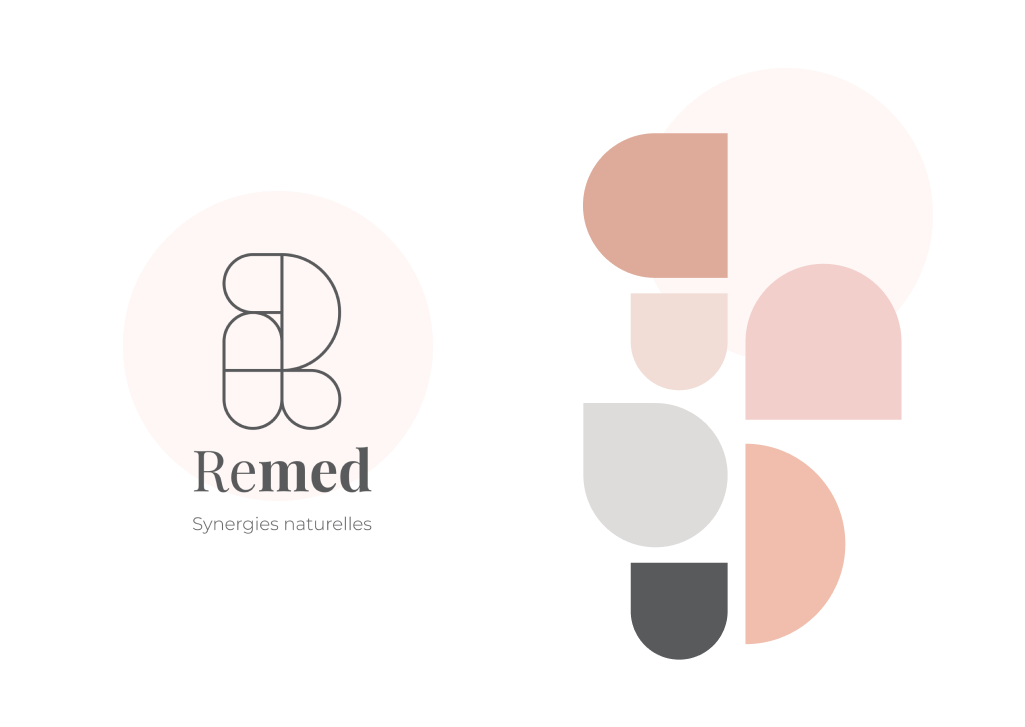
The color palette is inspired by nude skin tones, featuring a range of subtle, natural hues that reflect the diverse shades of skin. This selection creates a warm and inclusive aesthetic for the brand.
The shapes used in the design are influenced by the form of pills, reinforcing the product’s identity as a dietary supplement. Additionally, the letter R from Remed is integrated into the design elements, creating a cohesive and recognizable brand symbol.
Color
Inspired by nude skin tones, colours feature a range of subtle, natural hues that reflect the diverse shades of skin. This selection creates a warm and inclusive aesthetic for the brand.
Shapes
The shapes used in the design are influenced by the form of pills, reinforcing the product’s identity as a dietary supplement.


